[Android] ConstraintLayout 정리(9) - Virtual Helpers Objects
아래 내용은 Android Developer 공식 문서와 weekyear 님의 블로그 내용을 참고하여 작성한 자습 기록입니다.
📚ConstraintLayout 정리(9) - Virtual Helper Objects
이번에는 constraintlayout 구성 시 더욱 다양한 화면 배치를 도와주는 Virtual Helper objects에 대해 알아보자. Virtual Helper objects의 종류는 4가지로, 다음과 같은 것들이 있다.
- Guideline
- Barrier
- Group
- Placeholder
Helper objects의 경우 화면에는 보이지 않으며(View.GONE 상태로 처리된다), 레이아웃을 구성하기 위해 사용한다.
Guideline과 Group 같은 경우 안드로이드 강의 내용을 정리하면서 다룬 적이 있다. 이번에는 정확히 어떤 역할을 하는지, 어떻게 하면 더 효율적으로 다룰 수 있을지에 대해 정리해 보려고 한다.
📔 Guideline
가이드라인은 수평 또는 수직으로 지정할 수 있다. 수직 가이드라인의 너비는 0의 크기를 갖고, ConstraintLayout에 맞는 높이를 가진다. 반대로 수평 가이드라인의 높이는 0의 크기를 갖고, ConstraintLayout에 맞는 너비를 가진다.
가이드라인은 세 가지 하나의 방법으로 배치할 수 있다. 속성들 중 하나를 사용하여 배치할 때 중요한 점은 android:orientation 속성을 사용해 수직 또는 수평의 값을 지정해 줘야 한다는 것이다.
📖 Guideline의 속성
| 속성명 | 설명 |
|---|---|
layout_constraintGuide_begin |
기준이 수평일 때는 좌측, 수직일 때는 상단을 기준으로 특정 dp 크기만큼 가이드라인을 생성 |
layout_constraintGuide_end |
기준이 수평일 때는 우측, 수직일 때는 하단을 기준으로 특정 dp 크기만큼 가이드라인을 생성 |
layout_constraintGuide_percent |
퍼센트를 통해 가이드라인을 생성(0~1) |
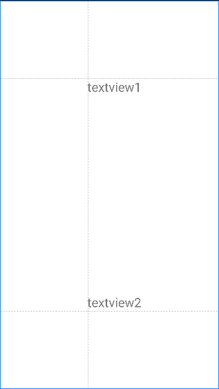
layout_constraintGuide_percent 속성을 사용한 가이드라인을 통해 레이아웃을 구성해 보자. 예제에는 3개의 가이드라인이 존재한다. 수직 가이드라인은 0.4의 위치에 배치되고, 수평 가이드라인은 두 개로, 하나는 0.2에, 다른 하나는 0.8의 위치에 배치되어 있다. 여기에 텍스트 뷰 두 개를 추가했는데, 모두 시작 사이드 제약을 수직 가이드라인에 지정하고, 수평 가이드라인 중 하나는 상단 제약을 위쪽 가이드라인에, 다른 하나는 하단 제약을 아래쪽 가이드라인에 지정하였다.
코드와 결과는 다음과 같다.
    <androidx.constraintlayout.widget.Guideline
        android:id="@+id/guideline1"
        android:layout_width="wrap_content"
        android:layout_height="wrap_content"
        android:orientation="vertical"
        app:layout_constraintGuide_percent="0.4" />

    <androidx.constraintlayout.widget.Guideline
        android:id="@+id/guideline2"
        android:layout_width="wrap_content"
        android:layout_height="wrap_content"
        android:orientation="horizontal"
        app:layout_constraintGuide_percent="0.2" />

    <androidx.constraintlayout.widget.Guideline
        android:id="@+id/guideline3"
        android:layout_width="wrap_content"
        android:layout_height="wrap_content"
        android:orientation="horizontal"
        app:layout_constraintGuide_percent="0.8" />

    <TextView
        android:layout_width="wrap_content"
        android:layout_height="wrap_content"
        app:layout_constraintStart_toStartOf="@id/guideline1"
        app:layout_constraintTop_toTopOf="@id/guideline2"
        android:text="textview1"
        android:textSize="24sp" />

    <TextView
        android:layout_width="wrap_content"
        android:layout_height="wrap_content"
        app:layout_constraintStart_toStartOf="@id/guideline1"
        app:layout_constraintBottom_toTopOf="@id/guideline3"
        android:text="textview2"
        android:textSize="24sp" />
📔 Barrier
Barrier는 뷰가 넘어가지 못하도록 장벽과 같은 역할을 하는 동적 기준선을 생성한다. 가이드라인이 수직과 수평 방향에 따른 위치 값을 지정해 준 것과 달리, Barrier는 여러 뷰의 id를 속성 값으로 지정하게 되면 지정된 뷰를 기준으로 적용될 방향의 외곽 라인에 맞춰 가상의 벽을 생성한다.
📖 Barrier의 속성
| 속성명 | 설명 |
|---|---|
app:barrierDirection |
지정된 뷰를 기준으로 적용될 방향을 정함 |
constraint_referenced_ids |
기준이 될 뷰를 등록 |
layout_constraintGuide_percent |
Barrier 생성 시, 지정된 뷰의 방향을 기준으로 여백을 두고 생성 |
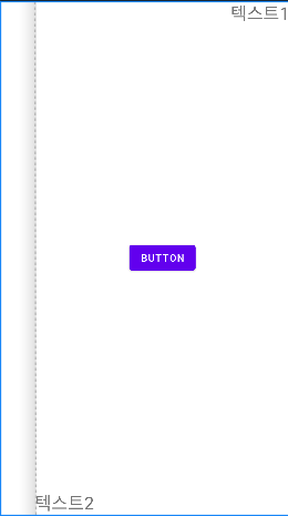
Barrier를 사용해 보기 위해, 텍스트 뷰 두 개를 만들었다. 그리고 constraint_referenced_ids를 통해 두 개의 텍스트 뷰를 등록하였고, 기준이 될 방향은 끝 쪽 사이드로 지정했다. 생성된 Barrier를 보면, 길이가 더 긴 text2가 기준이 된 것을 볼 수 있고, 이를 기준으로 16dp의 여백을 가진 Barrier가 생성되었다. 여기에 버튼 하나를 가이드라인과 같이 시작 사이드 제약을 Barrier로 지정하여 생성했다.
    <TextView
        android:id="@+id/text1"
        android:layout_width="wrap_content"
        android:layout_height="wrap_content"
        android:layout_marginTop="30dp"
        android:text="텍스트1"
        android:textSize="24sp"
        app:layout_constraintBottom_toTopOf="@id/text2"
        app:layout_constraintStart_toStartOf="parent"
        app:layout_constraintTop_toTopOf="parent" />

    <TextView
        android:id="@+id/text2"
        android:layout_width="wrap_content"
        android:layout_height="wrap_content"
        android:layout_marginTop="30dp"
        android:text="텍스트222222222"
        android:textSize="24sp"
        app:layout_constraintBottom_toBottomOf="parent"
        app:layout_constraintStart_toStartOf="@id/text1"
        app:layout_constraintTop_toBottomOf="@id/text1" />

    <androidx.constraintlayout.widget.Barrier
        android:id="@+id/barrier"
        android:layout_width="wrap_content"
        android:layout_height="wrap_content"
        app:barrierDirection="end"
        app:barrierMargin="16dp"
        app:constraint_referenced_ids="text1, text2" />

    <Button
        android:id="@+id/button"
        app:layout_constraintTop_toTopOf="parent"
        app:layout_constraintBottom_toBottomOf="parent"
        android:layout_width="wrap_content"
        android:layout_height="wrap_content"
        app:layout_constraintStart_toStartOf="@id/barrier"
        android:text="button" />
📖 Barrier의 Gone처리
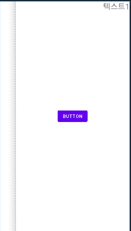
Barrier에서 지정한 뷰의 상태가 View.GONE이 되었을 때, Barrier의 유지 상태를 지정할 수 있다. 아래와 같이 두 개의 텍스트 뷰가 있고, 해당 텍스트 뷰들을 기준으로 삼는 Barrier가 2개 있다. 또 이 Barrier의 양 끝을 제약으로 하는 Button이 하나 있다.
    <TextView
        android:id="@+id/textView1"
        ...
        android:text="텍스트1"
        app:layout_constraintEnd_toEndOf="parent"
        app:layout_constraintTop_toTopOf="parent" />

    <TextView
        android:id="@+id/textView2"
        android:layout_marginStart="50dp"
        android:visibility="visible"
        android:text="텍스트2"
        ...
        app:layout_constraintBottom_toBottomOf="parent"
        app:layout_constraintStart_toStartOf="parent" />

    <androidx.constraintlayout.widget.Barrier
        android:id="@+id/barrier1"
        android:layout_width="wrap_content"
        android:layout_height="wrap_content"
        app:barrierAllowsGoneWidgets="true"
        app:barrierDirection="start"
        app:constraint_referenced_ids="textView1, textView2" />

    <androidx.constraintlayout.widget.Barrier
        android:id="@+id/barrier2"
        android:layout_width="wrap_content"
        android:layout_height="wrap_content"
        app:barrierDirection="end"
        app:constraint_referenced_ids="textView1, textView2" />

    <Button
        android:layout_width="wrap_content"
        android:layout_height="wrap_content"
        android:text="button"
        app:layout_constraintBottom_toBottomOf="parent"
        app:layout_constraintEnd_toEndOf="@id/barrier2"
        app:layout_constraintStart_toStartOf="@id/barrier1"
        app:layout_constraintTop_toTopOf="parent" />
현재 textView2의 상태가 View.VISIBLE일 때의 화면은 다음과 같이 barrier1이 시작 사이드의 기준을 textView2로 지정된 한 것을 볼 수 있다.
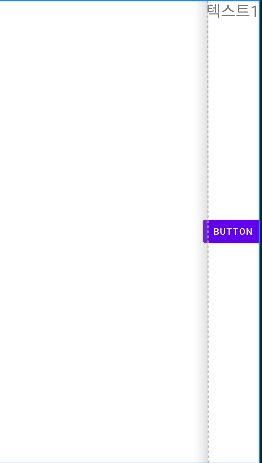
여기서 textView2의 상태를 View.INVISIBLE로 지정할 경우 화면에서 보이지 않지만 barrier1이 계속해서 참조하는 것을 볼 수 있다.
 <TextView
    android:id="@+id/textView2"
    android:layout_marginStart="50dp"
    android:visibility="invisible"
    android:text="텍스트2"
    ...
    app:layout_constraintBottom_toBottomOf="parent"
    app:layout_constraintStart_toStartOf="parent" />

<androidx.constraintlayout.widget.Barrier
    android:id="@+id/barrier1"
    android:layout_width="wrap_content"
    android:layout_height="wrap_content"
    app:barrierAllowsGoneWidgets="true"
    app:barrierDirection="start"
    app:constraint_referenced_ids="textView1, textView2" />
textView2의 상태가 View.GONE이 되면, barrier1는 계속해서 참조하는 관계가 설정되어 있기 때문에 전체 공간을 차지하게 된다. 이때, app:barrierAllowsGoneWidgets 속성의 값을 false로 바꾸면 textView2가 View.GONE 상태로 변경된 부분에 대해 참조를 중지한다는 의미를 가진다. 따라서 barrier1이 시작 사이드로 설정한 기준 뷰는 textView2에서 다음 기준이 될 수 있는 textView1이 된다. 그에 따라 barrier1의 범위 및 제약이 지정되어 있는 버튼의 위치는 textView의 영역에 맞게 배치된다.
 <TextView
    android:id="@+id/textView2"
    android:layout_marginStart="50dp"
    android:visibility="gone"
    android:text="텍스트2"
    ...
    app:layout_constraintBottom_toBottomOf="parent"
    app:layout_constraintStart_toStartOf="parent" />

<androidx.constraintlayout.widget.Barrier
    android:id="@+id/barrier1"
    android:layout_width="wrap_content"
    android:layout_height="wrap_content"
    app:barrierAllowsGoneWidgets="false"
    app:barrierDirection="start"
    app:constraint_referenced_ids="textView1, textView2" />
📔 Group
그룹은 그룹으로 등록된 뷰들의 visibility 속성 및 그림자 속성을 지정할 수 있다.
📖 Group의 속성
| 속성명 | 설명 |
|---|---|
constraint_referenced_ids |
기준이 될 뷰를 등록 |
Group의 사용 방법은 어렵지 않다. 앞서 적용해 보았던 가이드라인과 Barrier와 마찬가지로 먼저 그룹화 시킬 뷰의 id 값을 지정해 준다. 그다음 android:elevation 또는 android:visibility와 같은 속성을 사용하여 등록된 뷰들을 상태를 지정할 수 있다.
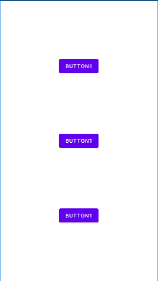
아래와 같이 세 개의 버튼이 있고 그중 button1과 button2을 그룹화 시켰다. 그룹화된 버튼들의 android:visibility 속성값으로 View.GONE을 지정해 주었을 때, 그룹으로 등록된 버튼들은 잠시 사라지고 그 빈 공간을 남은 버튼이 차지한 것을 볼 수 있다.
    <Button
        android:id="@+id/button1"
        android:layout_width="wrap_content"
        android:layout_height="wrap_content"
        android:text="button1"
        app:layout_constraintBottom_toTopOf="@id/button2"
        app:layout_constraintEnd_toEndOf="parent"
        app:layout_constraintStart_toStartOf="parent"
        app:layout_constraintTop_toTopOf="parent" />

    <Button
        android:id="@+id/button2"
        android:layout_width="wrap_content"
        android:layout_height="wrap_content"
        android:text="button1"
        app:layout_constraintBottom_toTopOf="@id/button3"
        app:layout_constraintEnd_toEndOf="@id/button1"
        app:layout_constraintStart_toStartOf="@id/button1"
        app:layout_constraintTop_toBottomOf="@id/button1" />

    <Button
        android:id="@+id/button3"
        android:layout_width="wrap_content"
        android:layout_height="wrap_content"
        android:text="button1"
        app:layout_constraintBottom_toBottomOf="parent"
        app:layout_constraintEnd_toEndOf="@id/button1"
        app:layout_constraintStart_toStartOf="@id/button1"
        app:layout_constraintTop_toBottomOf="@id/button2" />

    <androidx.constraintlayout.widget.Group
        android:layout_width="wrap_content"
        android:layout_height="wrap_content"
        app:constraint_referenced_ids="button1, button2"
        android:visibility="gone" />
📔 Placeholder
Placeholder는 이미 화면에 배치되어 있는 뷰에 대해서 재배치 및 재설정을 할 수 있도록 도와준다. Placeholder의 속성은 클래스 파일에서 이루어진다.
📖 Placeholder의 속성
| 속성명 | 설명 |
|---|---|
setContentId(id: Int) |
Placeholder로 재배치할 뷰를 등록 |
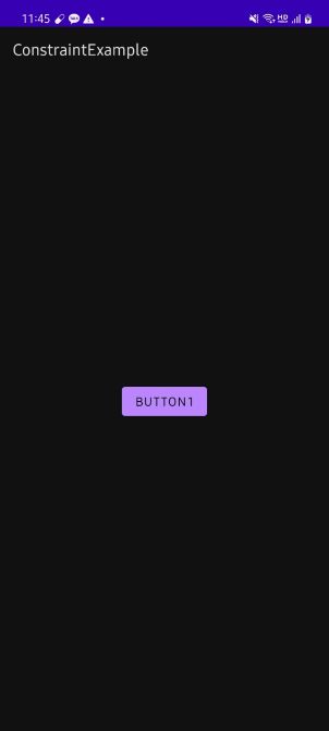
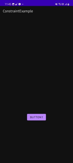
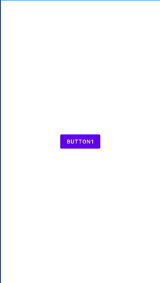
간단한 예시를 들어보자. 버튼이 하나 구현되어 있고, Placeholder를 생성해 버튼을 재구성하고자 하는 속성들을 설정할 수 있다. 아래에서는 간단하게 위치만 바꾸어 주었다. 그리고 클래스 파일로 가서 버튼을 클릭했을 때, Placeholder를 가져와 setContentId()를 사용해 이에 해당하는 값을 적용하도록 해주었다. 결과 화면을 보면 기존의 버튼을 View.GONE 처리가 된 것처럼 사라진 상태이고, Placeholder에서 지정한 대로 위치가 재배치된 것을 볼 수 있다.
    <Button
        android:id="@+id/button1"
        android:layout_width="wrap_content"
        android:layout_height="wrap_content"
        android:text="button1"
        app:layout_constraintBottom_toBottomOf="parent"
        app:layout_constraintEnd_toEndOf="parent"
        app:layout_constraintStart_toStartOf="parent"
        app:layout_constraintTop_toTopOf="parent" />

    <androidx.constraintlayout.widget.Placeholder
        android:id="@+id/placeholder"
        android:layout_width="wrap_content"
        android:layout_height="wrap_content"
        app:layout_constraintBottom_toBottomOf="parent"
        app:layout_constraintEnd_toEndOf="parent"
        app:layout_constraintStart_toStartOf="parent"
        app:layout_constraintTop_toTopOf="parent"
        app:layout_constraintVertical_bias="0.7" />
class MainActivity : AppCompatActivity() {
    override fun onCreate(savedInstanceState: Bundle?) {
        super.onCreate(savedInstanceState)
        setContentView(R.layout.activity_main)

        findViewById<Button>(R.id.button1).setOnClickListener {
            val placeholder = findViewById<Placeholder>(R.id.placeholder)
            placeholder.setContentId(R.id.button1)
        }
    }
}